
I am going to let you in on a secret.
What is my most reliable traffic and income source at Traffic Generation Café?
My email list.
And you know why?
Here’s how my day usually starts: I wake up, roll over, and before I even get out of bed, I reach for my phone, and check my email.
Then I check it again while drinking my first cup of espresso (the best part of my morning routine!), eating breakfast, and with every cup of coffee after that (and there are quite a few of them.)
On an average morning, I check email on my phone at least a couple of times before I ever get to my computer.
Sound familiar?
That’s because 80% of smartphone users check their phones within 15 minutes of waking up. (source: MediaBistro)
Considering there are currently 2.6 billion smartphone subscriptions globally, that adds up to quite a number.
According to Movable Ink’s US Consumer Device Preference Report 2015, a whooping 68% of all emails in 2015 was opened on mobile devices .
Litmus’ 2016 State of Email Report shows a slightly more modest, but still quite impressive 55% of mobile email opens.
Yes, emails drive traffic.
…IF they are easy to read across multiple mobile devices.
Yet, according to Econsultancy’s 2015 Email Marketing Census report, only 61% of marketers optimize their emails for mobile devices.
I surely do hope you are NOT one of them.
Leaving so much money on the table by failing to make your emails mobile friendly?…
Especially when it’s as simple as using the 7 email hacks below?
Of course, not. You are too smart for that.
And, I am sorry to say, by the end of this post you won’t have any excuses either. (You ARE going to read it to the end, aren’t you?)
First things first…
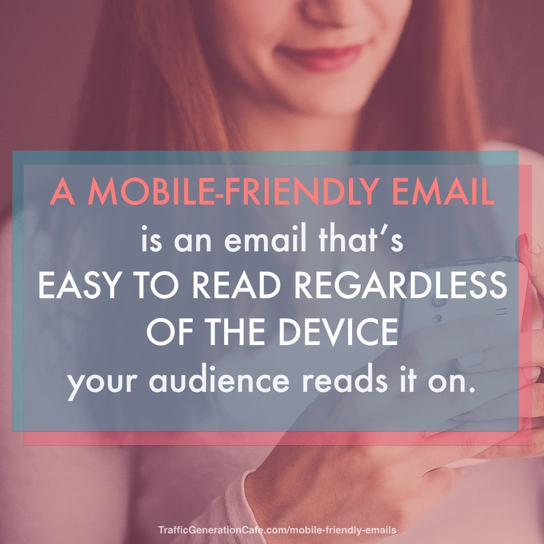
What is a Mobile Friendly Email?
A mobile-friendly email is an email that is easy to read regardless of the device your audience reads it on.
It’s a simplistic definition, I admit, but that’s all most of us need/care to know.
What is the difference between mobile responsive and mobile friendly emails?
Yes, there’s a technical difference between the two.
For those of you who like to be thorough, here it is.
Mobile responsive email
When viewed on mobile devices versus desktop clients, mobile responsive email uses “media queries” to adjust the layout of the email message, font sizes, images, and buttons; in some cases, they can even be used to hide or swap content. This means, in effect, there are two versions of the email - the desktop version and the mobile version. Based on where the message is being opened, PC or mobile device, the code automatically adapts and optimizes to the specific screen size or viewing device.
Mobile friendly email
Mobile friendly design can be defined as a single design that works well across both desktop and mobile email clients. There is no specific HTML/CSS code to adjust content or image sizes between the two platforms. Mobile friendly designs generally appear the same on a mobile device but ‘scaled down’ to about half the size.
Most email autoresponder services make their templates mobile responsive by default, like Aweber which powers my email list at Traffic Generation Café.
However, even with a mobile responsive template, your emails might not be that mobile friendly.
The mobile responsive template won’t tell you to keep your subject lines under 30 characters.
Or write your snippet text to encourage more opens.
Or optimize your email for a 3-second read.
My 7 hacks to create mobile friendly emails will do that - and increase your subscribers’ responsiveness AND your sales.
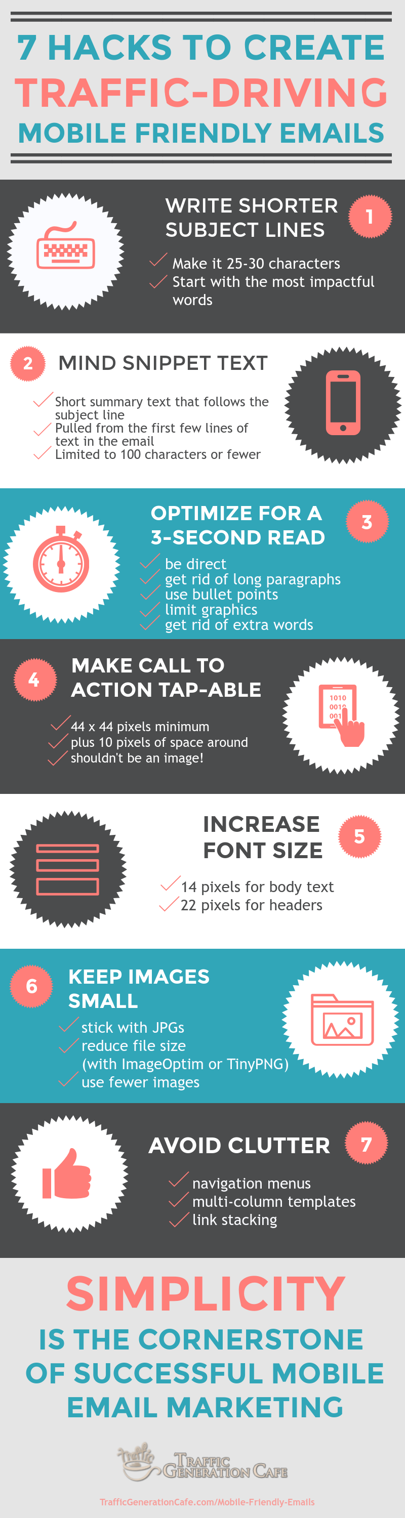
7 Hacks to Writing Mobile Friendly Emails
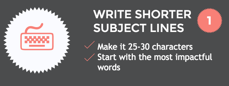
1. Write shorter subject lines
Your first order of business is to get your subscribers to actually open your emails.
That’s where your email subject line comes in.
Not only does it need to be enticing (similar to a headline of a blog post), but the shorter it is, the better.
Why?
A typical desktop inbox displays about 60 characters of an email subject line. However, mobile devices show just 25-30 characters.
If being concise is not your strong suite, here’s a compromise: place the offer or call to action at the beginning of the subject line where it’s more likely to be seen.
With that said… don’t let the subject line character count be your primary concern.
I really like what Tom Sather, Senior Director of Research at Return Path, had to say on the subject of email subject line length (as quoted in this post at MarketingSherpa.com):
“When testing subject lines, don’t focus on how long a subject line is. Don’t try to be clever - unless that’s an essential part of your brand - and don’t be vague. Tell the subscriber in the first few words what’s in it for them, create a sense of urgency when possible, and tell them exactly what they should do.”
So:
- don’t try to be clever
- don’t be vague
- tell them what’s in it for them
- create a sense of urgency
- tell them exactly what they should do
Wow… now that I put it in bullet points… that’s quite a tall order!… I might never write another email if I try to express all that in under 30 characters… 😉
Here’s a great resource to help you write better email subject lines:
The Art and Science of Subject Lines - ReturnPath.com PDF guide (optin download)
2. Mind the snippet text
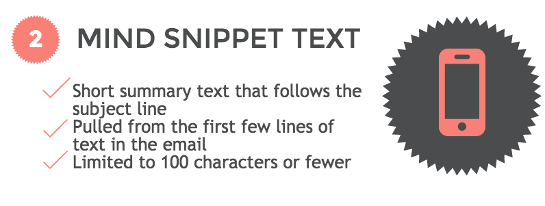
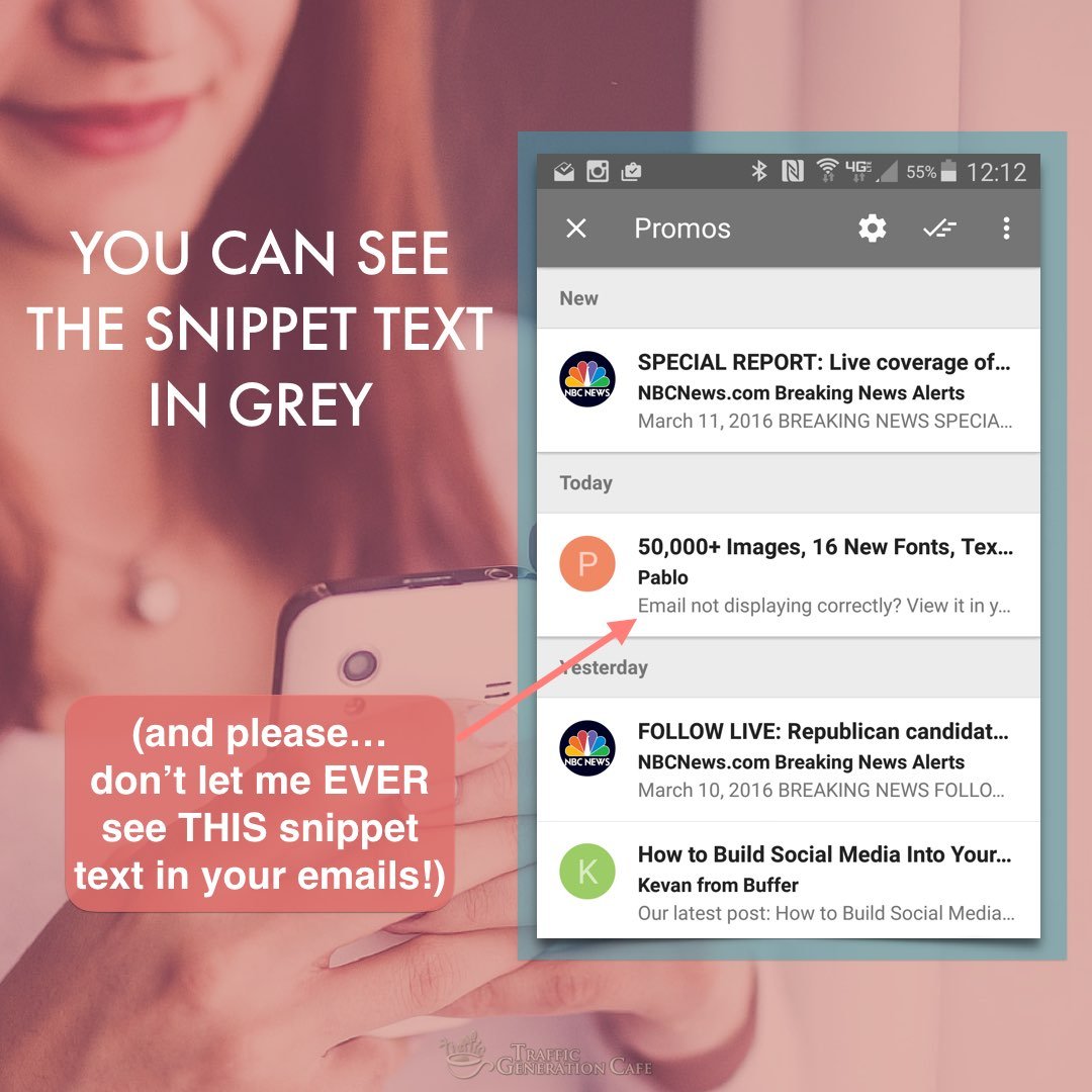
Snippet text (also referred to as preheader or preview text) is the short summary text that follows the subject line when an email is viewed in the inbox.
Think of it as a wingman to your subject line.
Snippet text is usually limited to 100 characters and pulled from the first few lines of the email body.
Use this valuable email real estate to build on the subject line, add value, or include a call to action.
To see great examples of making the most of preheader text, read:
9 ways smart email marketers are using preheader text - Jeff Slutz at myemma.com
3. Optimize for a 3-second read

Phew… your subscriber was curious enough to open your email.
Your next hurdle is to get them to read it.
Nearly half of your mobile readers will spend three seconds or less with your email.
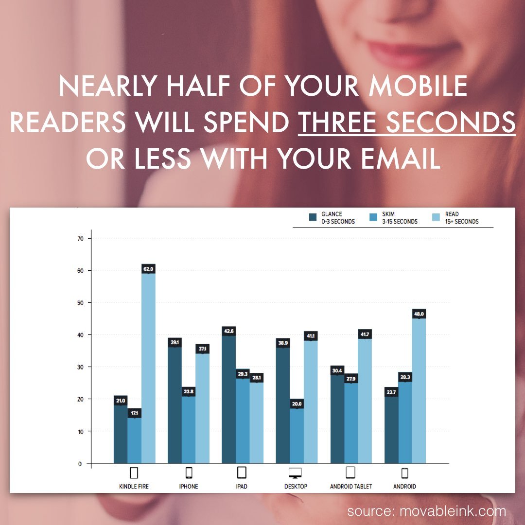
Make the most of the 3 seconds you have: keep ’em short ‘n sweet.
The shorter the copy, the easier it is for people to scroll on mobile.
A few things you can do to keep your emails short:
- be direct;
- get rid of long paragraphs;
- use bullet points;
- limit graphics;
- get rid of extra words.
Kind of like this:
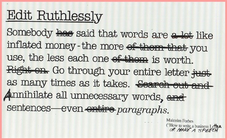
(In the spirit of editing ruthlessly… the first draft of this post was over 2,200 words. It’s now down to under 1,700. Over 500 useless words! As a result, you’ll have spent a lot less time reading the post while still getting the most out of it. Sweeeeeet!)
Moving on.
4. Make CTA tappable
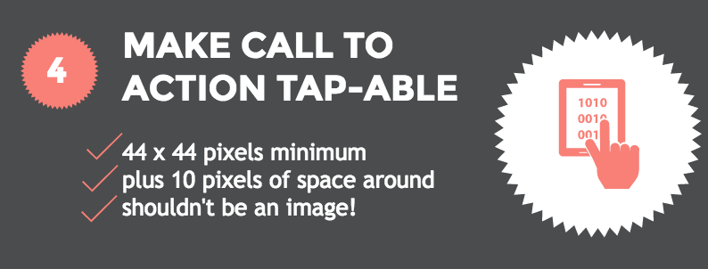
There’s nothing worse for a mobile email reader (and, most importantly, for your business!) than not being able to tap on a link.
Make your call to action (CTA) easy to tap on a mobile screen.
The minimum recommended “tappable” size is 44 x 44 pixels with 10 pixels of space around them.
Also, some folks still have their images turned off by default, so don’t make your call to action an image.
A text link works just fine.
However, consider…
Click here to get access to the free Bite-Size Traffic Hacks email series
OR
Click here to get access to the free Bite-Size Traffic Hacks email series
Which one of the links above is easier to tap on a mobile device? Or even your next blog post for that matter (yes, more and more people read your site on mobile too!)?
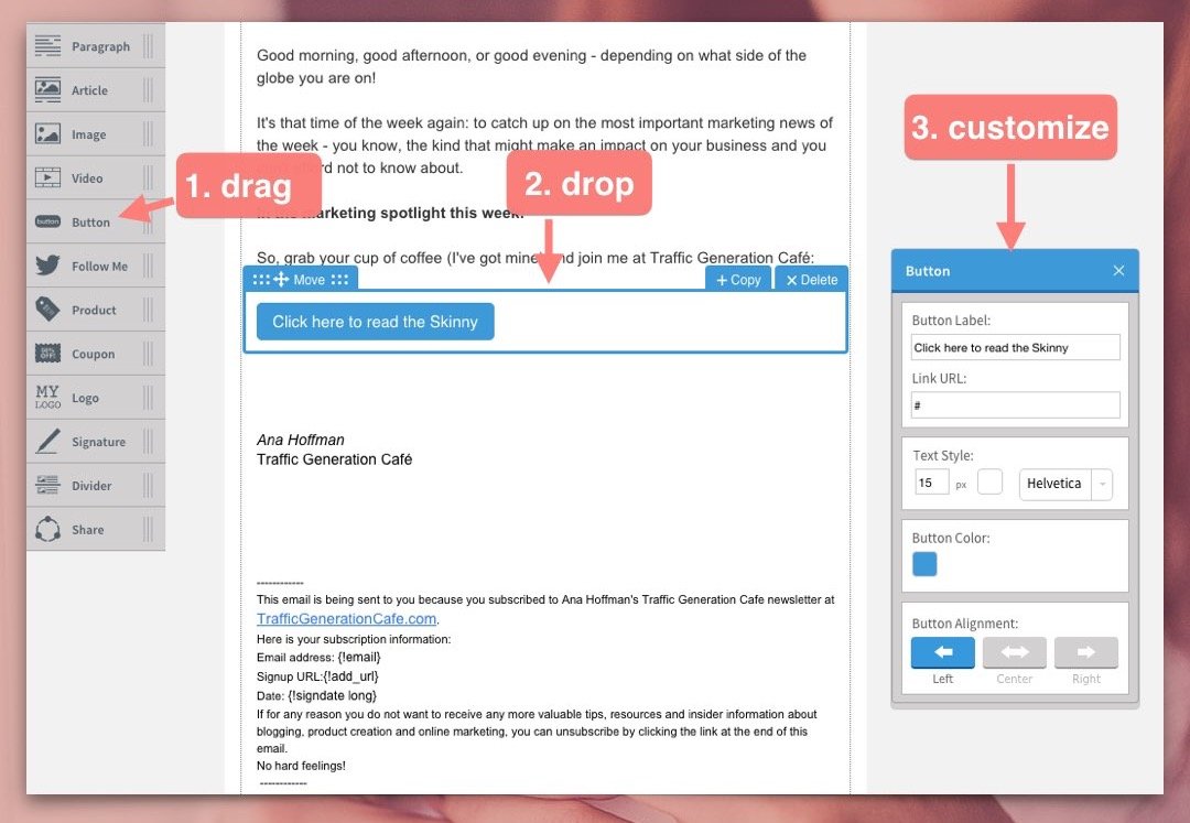
If you really want to display your CTA as a button, make it a CSS-created button.
Don’t know how? Most email autoresponders allow you to add a properly coded button without any extra work on your part.
For instance, here’s how to add a customizable CTA button in Aweber’s Drag & Drop Editor:
One last note: might be a good idea to add your CTA to the beginning of your mobile friendly email as well as the end - get those 3-second readers tapping!
5. Increase font size
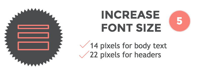
Small fonts are hard to read on a desktop computer, let alone on a mobile screen.
What font size should you choose for a mobile friendly email?
A minimum font size of 14 pixels for body text and 22 pixels for headers is a good rule of thumb.
6. Keep images small
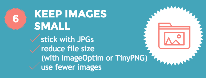
Emails must load fast. Finger-snapping fast.
Images drag load times down.
Don’t let it happen. Here’s how:
- stick with JPGs (crisp colors, yet small image sizes);
- use ‘save for web’ option many graphics programs (like Photoshop) offer;
- reduce file size before uploading to your email client with ImageOptim (my personal choice), TinyPNG, or JPEGmini;
- use fewer images, period.
Don’t forget to add ALT text to all images. Many email clients load images automatically, but some don’t. That’s where the image ALT text comes in - it describes what your subscriber should see.
Pro Hack: make those images clickable… because people like clicking on ’em!
7. Avoid clutter
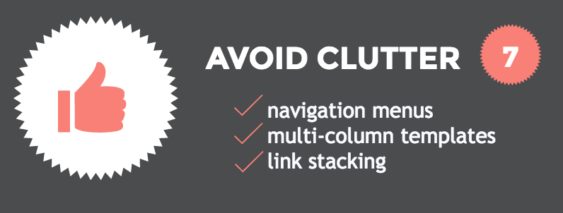
Remember, simplicity is your friend when creating a mobile friendly email.
With that said, avoid:
Also, remember to leave breathing (and tapping) room for all your elements.
Simplicity Is Email’s Best Friend
There’s a common trend in all the mobile friendly email hacks above: shorter, cleaner, simpler.
Shorter emails.
Plenty of white space.
Saying more with less.
Simplicity is THE cornerstone of successful email marketing - especially mobile email marketing.

Simplicity shows your respect for your subscriber. And respect tends to come back tenfold.
Here’s a simple challenge that might help you to write simpler emails: type your next email out on your phone. That’ll put a lot of things into the right perspective.
Let’s Put It All Together
Share This Image On Your Site
Mobile Friendly Email: Marketing Takeaway
Don’t let me catch you writing a non-mobile friendly email - ever again.
You know too much to do that.
You know what impact (positive and negative) mobile friendly emails can have on your business.
You also know how easy it is to make your emails mobile friendly.
Bottom line: you’ve officially run out of excuses.
Off working on my next mobile friendly email,
 Think Outside the Blog: External Ways to Build Your Email List
Barb
Thank you so much for this. I’m still learning the ins and outs of email lists so this is perfect. I’ve definitely been guilty off too many and too big when it comes to images. That’s my first fix
So glad to hear you found this post helpful, Barb! First step is the most important one. 😉
Asad Maqsood Awan
Hi Ana.
Great post with new things to learn. Thanks for sharing it with us. The timing of your post is perfect. This is exactly the kind of information I was going to begin researching today for my finel year project.
You are welcome, Asad.
Neil Sheth
Hey Ana,
Good post! I like the subtle difference of making a whole sentence clickable vs “click here”, wouldn’t have even thought about it otherwise. Interesting to see in the comments you mentioned doing a test against the button.
Subject line wingman, LOL - it’s so easy to ignore snippet text, and using it to add value is a great idea.
All the best,
Neil
Honestly, I’ve learned so much while writing the post, Neil; couldn’t believe how much of a difference a few slight tweaks could make! And yet they did…
Just remembered a little snippet text trick (maybe should add it to the post…) - repeat your brand name in the snippet. For instance, my ‘from’ name is Ana Hoffman (naturally), but as much as I’d like to think everyone who gets an email from me (despite the fact they asked for it!) knows/remembers my name, they don’t. Saying ‘Ana Hoffman TrafficGenerationCafe.com’ is out of the question.
Thus, I keep my snippet text the same for most of my emails and it starts with ‘TrafficGenerationCafe.com…’ That way if someone forgot my name and is wondering why on earth they are getting an email from me, my site name does help clear that up.
It also helps with the writing block quite well - not that easy to come up with a killer snippet text in every email. 😉
Jesse Wojdylo
Wow! This resource is fantastic. It will take me a week to go through all the links. Email is probably my weakest link as it is not something I have focused on in years. I will definitely have to give it a look as many people have told me they make a living from email marketing.
I, personally, have never made a purchase from email but it is obvious many others do.
Thanks so much for all the hard work on this article.
I am with you, Jesse - email has never been my favorite communication method, neither on the sending or receiving end. However, as you noted, we are more of an exception.
John D.
I would honestly love to see an example of a truly compelling email designed for mobile. I don’t think I’ve ever actually read a marketing email on my smartphone… I suppose maybe I should sign up for more email lists! Haha.
In this post, I focused more on being ‘readable’ - a great first step. Compelling? Not exactly my area of expertise. 😉
Thanks for coming by, John.
Ingrid Cliff
I had a few “whack on the side of the head” moments reading this post. Definitely going to test the CTA CSS button vs full underline options in this week’s newsletter.
I know, right?…
Thanks for stopping by, Ingrid; let me know how it goes.
Abhishek
Hey Ana,
Needless to say this was an amazing conversation. Really liked the idea. Also, we are in the time where mobiles are more popular then desktop due to ovious reason and so one should definitely work on that to give customer better experience
Thanks for sharing.
-Abhi
Right you are, Abhi - ignore mobile at your own peril!
I love the CTA reminder. Making the link more clear definitely invites those clicks! And I have learned my lesson in the large images. They simply take up too much real estate. Great tips!
Happy to help, Demetria!
Speaking of CTAs, after I wrote this post, I decided to play with button CTA vs text link CTA. Although this was not a true split test, the results between the two click-through rates is staggering!
Just goes to show, learning/testing/improving never ends…
Ana, thanks for reminding about an importance of mobile-friendly emails. As always, valuable read.
Pleasure and thanks for coming by, Anna.
Hi Ana,
Wonderful post indeed
You’re so right - I do check my email the first thing in the morning on my smartphone. The first thing I do is delete all the useless emails. Thinking of that, I better follow your suggestions and optimize my emails to avoid others give me the same treatment too thinking that my emails are useless!
Thanks for reminding me that my email subject lines should be shorter. I guess with time most of your suggestions will also be applicable for blog posts for mobiles…who has the time and patience to read long posts on mobiles!
Great post with new things to learn. Thanks for sharing it with us. Have a nice week ahead
Somehow we all think we are exempt from being quickly deleted from the inbox (surely, every email we ever send is a gem and our subscribers are dying to read them!), yet when the tables are turned and we are on the receiving end, we end up deleting more emails than we read - mostly because those emails fail to grab our attention.
Fighting those odds are a challenge. That’s why I thought it was so important to share what I’ve learned about writing mobile friendly emails!
Appreciate you coming by, Harleena.
Hi Ana. The timing of your post is perfect. This is exactly the kind of information I was going to begin researching tomorrow for a project I have. I don’t have a smart phone, so I read all of my email on a computer. Therefore I don’t really think much about mobile email. It’s very important for this next project though, so thanks for the excellent advice.
So glad to hear it, Ben!
The first smartphone I got was less than a year ago, so I know what you mean about being unaware how mobile affects everything we need to do as online business owners. Ignorance is NOT a bliss in this case though. 😉